Many years ago, on a trip to the USA, I noticed something I thought really weird. What was it? A firetruck. So, what’s weird about that? Well, it was not the truck as such, but the colour. A yellow green colour. It questions why a green stair nosing isnt on offer.
So, out the window with the red we associate with firetrucks. BTW, here’s an interesting write-up on the use of that colour on firetrucks, as experienced by the City of Sandusky Fire Department.

Skatebiker, vector by Adam Rędzikowski
Never thought much about it until I came across a number of articles about colour visibility to the human eye.
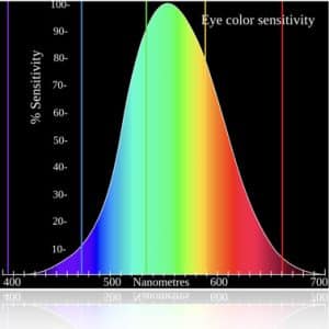
We note from the chart that the curve peaks at 555 nanometers. This means that under normal lighting conditions, the eye is most sensitive to a yellowish-green color. When the light levels drop to near total darkness, the response of the eye changes significantly as shown by the scotopic response curve on the left. Ok, so we get technical here. We include an eye sensitivity chart (see below). The left side refers to near darkness proceeding to the right section of the chart, which shows normal light.
At this level of light, the eye’s photoreceptors (rods) are most active and the human eye is more sensitive to the light present, and less sensitive to the range of color. Rods are highly sensitive to light but are comprised of a single photo pigment, which accounts for the loss in ability to discriminate color.
At this very low light level, sensitivity to blue, violet, and ultraviolet is increased, but sensitivity to yellow and red is reduced. The heavier curve in the middle represents the eye’s response at the ambient light level found in a typical inspection booth. This curve peaks at 550 nanometers, which means the eye is most sensitive to yellowish-green color at this light level. Fluorescent penetrant inspection materials are designed to fluoresce at around 550 nanometers to produce optimal sensitivity under dim lighting conditions.
Also, we note that the yellow line is at the 589 nanometers. And, yellow is the the more commonly used colour for safety use. And, in our industry, I refer to our use in our anti slip green stair nosing or bull nosings. We wrote about the use of safety yellow in a previous article.

In that post, we queried the use of yellow paint, which doesn’t really last, compared to the yellow in our steel stair nosings—Gripmaster, of course.
Ok, so where are we going with this article, well, we wanted to make you aware about the colour at 555 nanometers. We refer to RAL 6018 which matches Pantone 363, for readers who relate more to the Pantone Matching System.
And, here it is our new Gripmaster steel green stair nosing in the new green colour. Note that the new coloured steel stair nosings will be available soon.
Contact us, if you want more details, or want to make an advance order prior to product release.


